This site
A portfolio is a work sample, so the site had to make the same argument the work does.
- Role
- Design and development
- Timeframe
- Fall 2026
- Team
- Solo
- Tools
- React, TypeScript, Vite, CSS Modules, View Transitions API

A · The brief
A portfolio
[TODO: Seth — This site: what you set out to make, in your own words]
B · Taking it further
Making it a work sample in itself
[TODO: Seth — This site: what a design engineer portfolio actually had to prove]
Explorations
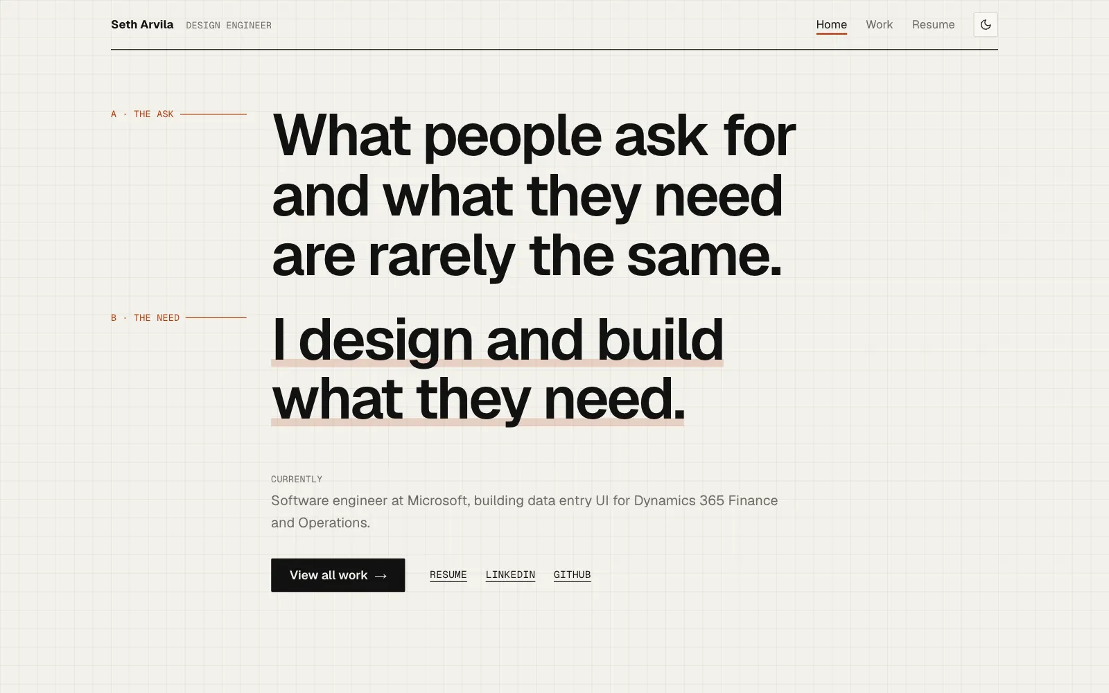
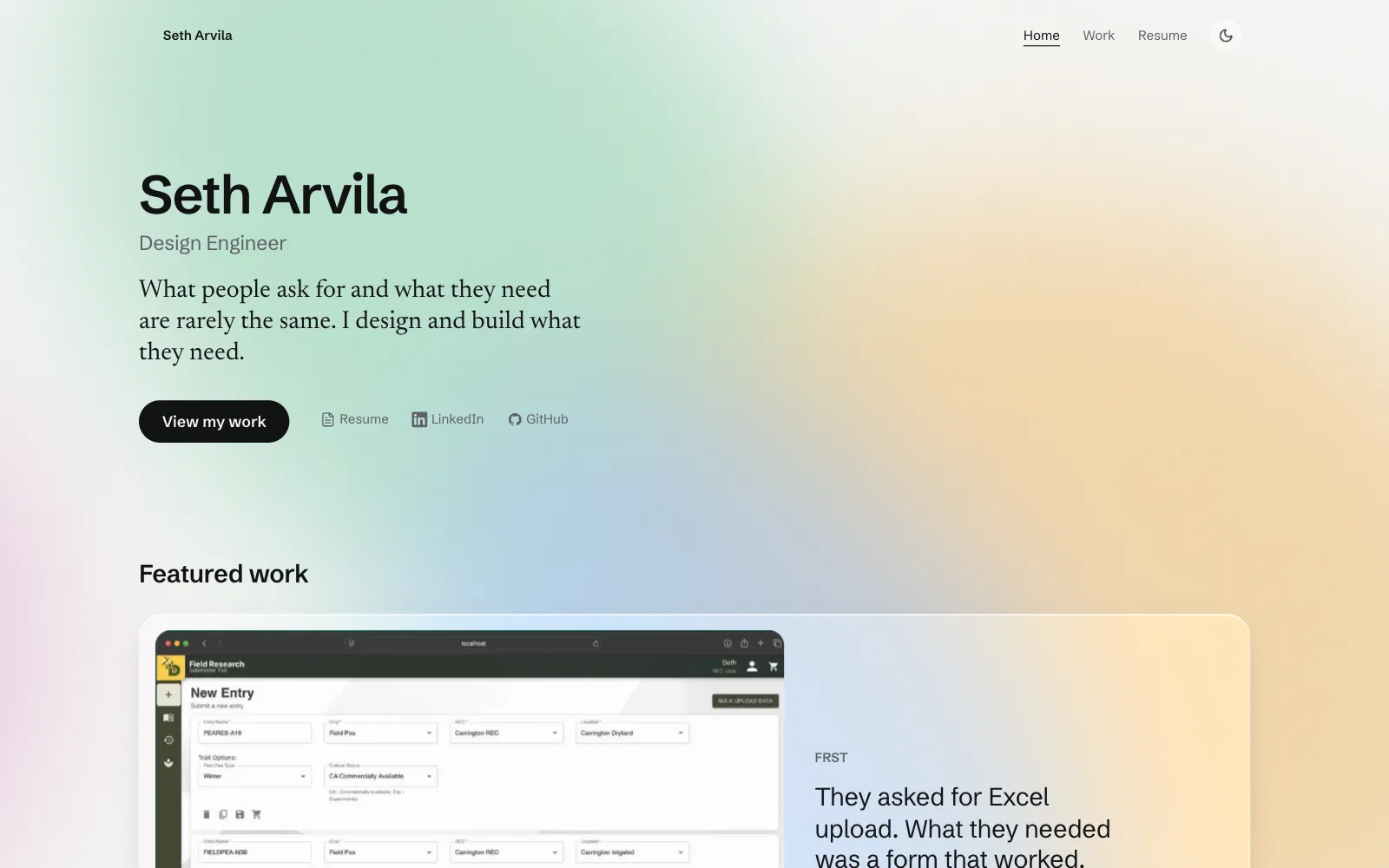
Fig. 2.1 The first direction, frosted glass over drifting color, against the spec sheet that replaced it.

The solution
Headings drawn over the real text
Each page title is traced in by an SVG copy laid exactly over the real text, which stays in place for layout, selection, and screen readers. The copy is measured from the text itself and removed once the ink is filled.
A card that becomes the case study
Opening a case study morphs its card’s image and title into the header with the View Transitions API. Shared names are set only on the card being opened, so no other navigation has an unmatched element to mishandle.
Only the content moves
Page changes move the page, not the paper: the old content sinks out, the new content fades up once the transition ends, and the drafting grid stays still. The red underline springs between links on the same curve.
Prerendered, then hydrated
Every page ships as static HTML with its own styles and scripts linked up front, so it paints complete and never shifts as it loads.
Impact and reflection
[TODO: Seth — This site: outcome]
What I'd do next
[TODO: Seth — This site: what you'd do next]